
Introduction
With our company’s growth, we need to ensure we present ourselves in a way that is consistent with our message. Our vision, values, and hard work should be evident in the quality of the visual and written attributes of our brand.
These guidelines cover all of the elements comprising the system for our brand identity. They were built with a sufficient level of flexibility to support you in your needs. Follow them diligently and you’ll always be caring for the Colt brand in the dignity it deserves.
Brand Identity
In this section, we outline the fundamental components of the Colt brand. By understanding what we stand for and what our mission is, you can also understand the strategy behind how we present ourselves to the world.
Brand Essence
Built on Integrity
A brand essence is a brand’s mantra. Even when it isn’t used as an external slogan, it’s our reason for being. In a few short words, it defines what our purpose is.
Our mission is to be an industry leader trusted to take on any project and execute it with an exceptional level of professionalism and commitment to quality. Colt is one of the most sophisticated, professional, and trustworthy framing sources in the country, inspiring our essence.
- We have a strong focus on safety and quality.
- We’re equipped to handle anything that comes our way.
- We execute on time and budget.
- We provide exceptional products and services.
- Our team members are incredibly experienced and knowledgeable.
- Overall, in every way, we are passionate about doing the right thing.
Brand Personality
Our personality pillars are the core components of the face to the Colt Builders brand. These qualities are intrinsic to our identity, and they should always be represented in our overall presentation.
Sophisticated
We are one of the most experienced and professional premium framing entities.
Honorable
Our guiding principle is to always do the right thing for our clients and team.
Unlimited
We take pride in our success but know we have potential as we continue to evolve.
Diligent
At Colt, our hard work and thorough approach set us apart from the rest.
Eager
Enthusiasm fuels the Colt team. We are truly excited to work together for our clients.
Brand Voice
Every piece of written content is an opportunity for us to convey our brand’s unique personality. Aside from technical language, all other pieces of copy should be seen as a marketing opportunity. This section of our guide covers how you can craft content that feels like it belongs to our brand.
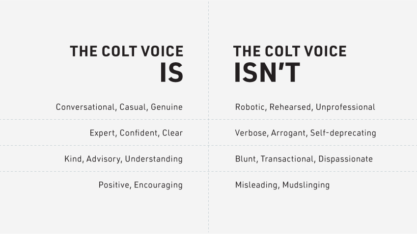
We are real people.
Unless a piece of content is technical in nature, our writing should have a vaguely conversational quality about it. We never want to sound overly casual and should never rely on slang. However, our content should be genuine, accessible, and show us as relatable professionals.
We are confident.
Our brand voice should empower and encourage any client that reads it. They should feel excited to work with us because we’re letting them know that (with Colt) anything is possible. We always want to use an active voice (versus a passive one) and never appear pessimistic.
We’re kind and clear.
To write content that’s easy for our clients to absorb, we always want to err on the side of brevity. We want to keep things concise and to the point, but we must never sound blunt. Don’t use 13 words if five will do it, but add in a couple more if those five could be seen as rude.
Corporate Logo
Our logo is our brand’s signature, and it’s our most integral brand element. Treating it with respect is key to ensuring our presentation speaks to our quality service and overall mission.
Logo Use
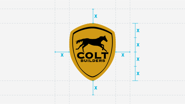
We always want to make sure that our logo has enough negative space around it to ensure it’s treated respectfully and other design elements aren’t confused as being part of our logo.
Area of Exclusion
As a rule of thumb, the space surrounding our logo on each side should be the equivalent of ¼ the height of our logo.
Sizing
In digital applications, our logo should never be smaller than 130px tall, or shorter than .75 inches tall in print.

Color Variations
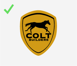
The color configurations shown above are the only approved variations of our logo. The full-color version (shown above over a light gray for contrast) is our preferred version. However, we have two other options:
- If our logo needs to appear on Colt Gold as a background color, then it’s permissible to use a black reverse version of the logo.
- If our logo needs to appear in an application where color is limited (like a newspaper ad), then using a black and white version is acceptable.
Logo Misuse
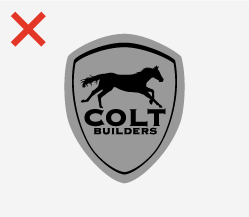

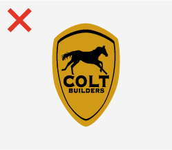
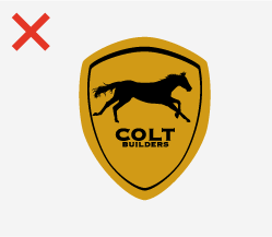
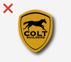
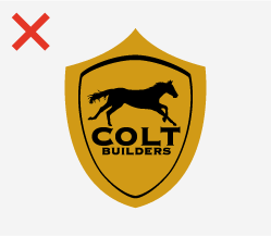
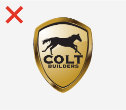
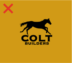
The diagrams above show typical examples of improper logo use. These examples are not acceptable, and they degrade the visual integrity of our brand.
- Do not use another color for our logo beside the options in the Logo Use section of our guide (Figure o1).
- Do not tilt or rotate our logo, so it isn’t standard, vertical orientation (Figure 02).
- Do not stretch or distort our logo so that it uses incorrect proportions (Figure 03).
- Do not adjust the proportions of our typography or the horse within our logo. Their relationship should never change (Figure 04).
- Do not apply special effects to our logotype, including drop shadows, lens flares, and glow effects (Figure 05).
- Do not adjust the shape of our logo’s shield. The only approved shape is shown in our Logo Use section (Figure 06).
- Do not use outdated versions of our logo, including the metallic gradient version of our logo (Figure 07).
- Do not allow the horse and typography from our logo to appear without the shield (Figure 08).
- It is acceptable for the horse to appear by itself, but never in a situation where it needs to represent our brand out of context (for instance, on a partner website).
- The only instance where an exception to this rule is made is as an overlay on video content. For more information on this use, see the Multimedia Logo section of this guide.
- Do not use our logo in a way where the quality or resolution of the file isn’t appropriate for the application (Figure 09).
Multimedia Logo

Our multimedia logo is a unique treatment we use specifically and exclusively during intros within video content. This dramatic application allows more footage to share visual real estate with our brand mark.

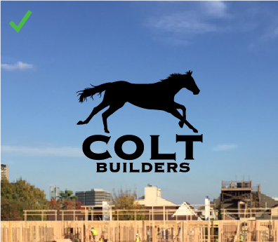


When the Multimedia Logo is appropriately used, it appears in black or white (Figures 01 and 02) over a background that provides enough contrast. One of the benefits of the shield is to maintain legibility, so greater care needs to be taken to treat our logo with the respect it deserves.
Because of the materials we work with, the Multimedia Logo should never appear in gold (Figure 03) because it can blend in with footage with too many neutral colors (like brown, tan, bronze, etc.). Low contrast could make our brand mark invisible to people with visual impairments.
Also, prevent our logo from appearing over footage with complex shapes, human subjects, rapid movement, textures, and patterns (Figure 04). Never allow our logo to appear jumbled with the footage it’s placed over. Making sure the logo is placed over negative space or large, simple shapes will ensure that the quality of our brand is never undermined.
Typography
Our brand has a typographic palette that is meant to convey the strong, diligent components of our personality without losing sophistication and integrity. Only use the typefaces identified in this section for branded content and implement them within these specifications.
Din Bold and Din Regular are the two fonts we rely on for nearly all our brand touchpoints.
Din Bold should be used for all headlines and consistently in all caps. To ensure that it commands the most attention, ensure that it is always set at a noticeably larger size than all adjacent pieces of type.
Din Regular should be used for any other type within a layout. It can be used for subheads (in all caps and set as a size that’s smaller than any headlines) or for body copy (in standard sentence case).
We can also incorporate Lato into a layout for body copy in print applications. Lato is approachable, readable, and provides a solid contrast to Din.
Lato shouldn’t be used in interactive applications, and (most importantly) we need to remember that Lato is not a websafe typeface. That means that if it appears in a Word document, PowerPoint, or email, the recipient may not see our content the way we want it to appear.
The only other typeface that we should ever use for the Colt Builders brand is Tahoma. For headlines, we can use Tahoma in its bold weight (in all caps, as though it were Din) or its regular weight for body copy.
We should only use Tahoma in applications where it isn’t possible to use Din. For instance, it isn’t always possible to embed Din in a Microsoft Office application, so Tahoma is preferable for Microsoft Word or PowerPoint.
Tahoma should also be used in instances when we need a web-safe font. For example, ensuring every email recipient will see Din isn’t possible, so Tahoma is our preferred alternative.
Color
Pantone
1245
| CMYK: | 2 31 98 16 |
| RGB: | 210 155 25 |
| Hex: | #D29B19 |
Pantone
Black C
| CMYK: | 60 40 40 100 |
| RGB: | 0 0 0 |
| Hex: | #000000 |
Designing for the Colt Builders brand uses two main colors (in combination with white). Colt Gold (Pantone 1245) and Rich Black (Pantone Black C).
To ensure our colors are as deep and vibrant as possible, we’ve developed Hex values and RGB formulas that deviate from the typical Pantone guidelines. Remember to follow our specifications when designing for digital applications. When printing black, consult your printer for their ideal recipe for a rich black, but the CMYK values we’ve included are a good rule of thumb.
Photography
When a brand has clear, consistent art direction in its photography, you’re able to build a visual language that represents the personality of the brand itself. To ensure our photos are always a reflection of our strategy, follow these simple guidelines.


Project Photos
We provide expansive, comprehensive solutions that apply to complex, impressive projects. We prefer using drone photography because it shows how remarkable our work is.
If you need to take ground-level photos (due to restrictions on drone photography or to capture detail), please remember:
- Choose a time to shoot when shadows aren’t cast over the project, and deep shadows aren’t an issue.
- Make sure the job site is clean, and you’re aren’t unintentionally shooting clean-up in progress.
- Ensure anyone captured in the shot is someone at work.


Lifestyle Photos
When taking lifestyle photography, make sure the subject is not looking at the camera, appears confident and capable, and has clearly been caught in the moment. Avoid taking photos where it’s unclear what’s happening in the scene, where the subject looks distressed, or where we might misrepresent our teams.

Portrait Photos
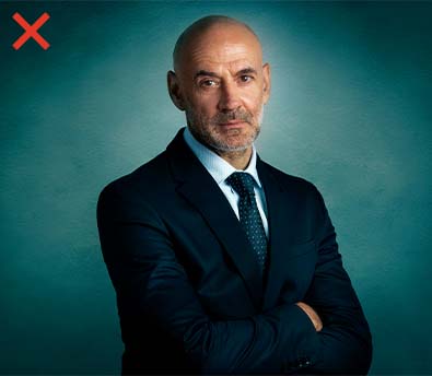
Portrait photography is best taken in an actual setting (preferably on-site or outdoor), where they can appear in natural light. Subjects should appear natural, comfortable, and in attire that they would typically wear while working or meeting a client.
As a rule of thumb, there are some general rules we carry across all our portrait photos:
- Avoid styling subjects with distracting accessories like brightly colored ties or flashy pieces of jewelry.
- Avoid tight patterns (like small polka dots) because they don’t translate as well to photo.
- Don’t wear safety vests, helmets, or other items from the job site that would be distracting.
- Don’t shoot subjects in front of a background that doesn’t provide suitable contrast to what they’re wearing (i.e., someone wearing a light blue shirt in front of a light blue sky).
Portrait photos shouldn’t be taken in studios because it will be more challenging for us to consistently reproduce the same style repeatedly. If it isn’t natural for a subject to smile in a photo, that’s fine! We should capture them in a genuine expression where they appear approachable, rather than show them looking in an off-putting way.